GitHub Next recently unveiled Monaspace, a ‘superfamily’ of monospace fonts for code. It comes with five fonts. These are my very uninformed first impressions of them, along with their description from the website:
- Neon: a traditional monospace code font (neo-grotesque sans)
- Argon: Neon but with more curve (humanist sans)
- Xenon: lots of serifs (slab serif)
- Radon: Comic Sans-style handwriting font (handwriting)
- Krypton: sharp, angled, distinctive (mechanical sans)
The fonts have three variables: font size, weight, and width. There are about 640k combinations, according to GitHub. All of the fonts have the same metrics, meaning that they can be mixed and matched easily.
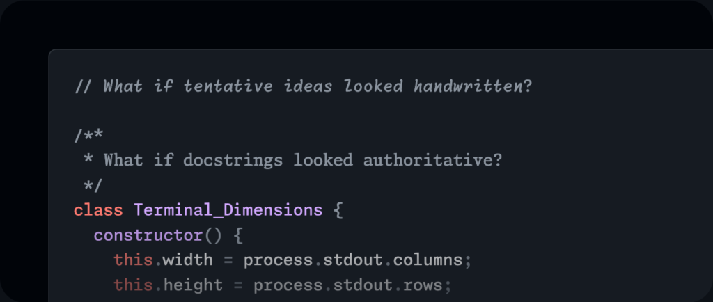
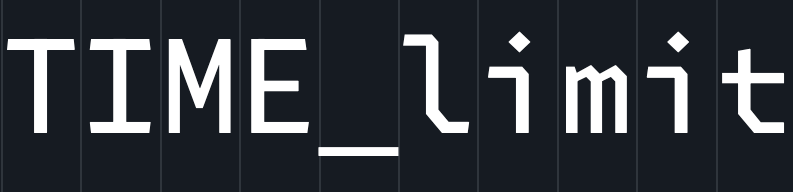
It comes with a feature called ‘texture healing’, which fixes the density of content with monospace fonts. Some letters don’t have enough space, like ‘m’, while some have too much, like ‘i’ and ‘l’. Texture healing allows these letters to shift around to improve density while keeping them in line.
(There seems to be an issue with the image comparison thing above on at least Firefox and Safari. Resizing the viewport by, say, resizing the window or opening the developer console seems to fix it.)
There are, of course, also many ligatures that can be selectively turned on and off, based on your needs.
I currently use JetBrains Mono, but Monaspace looks really nice and seems to fix a lot of issues with monospace fonts in general.
Leave a Reply